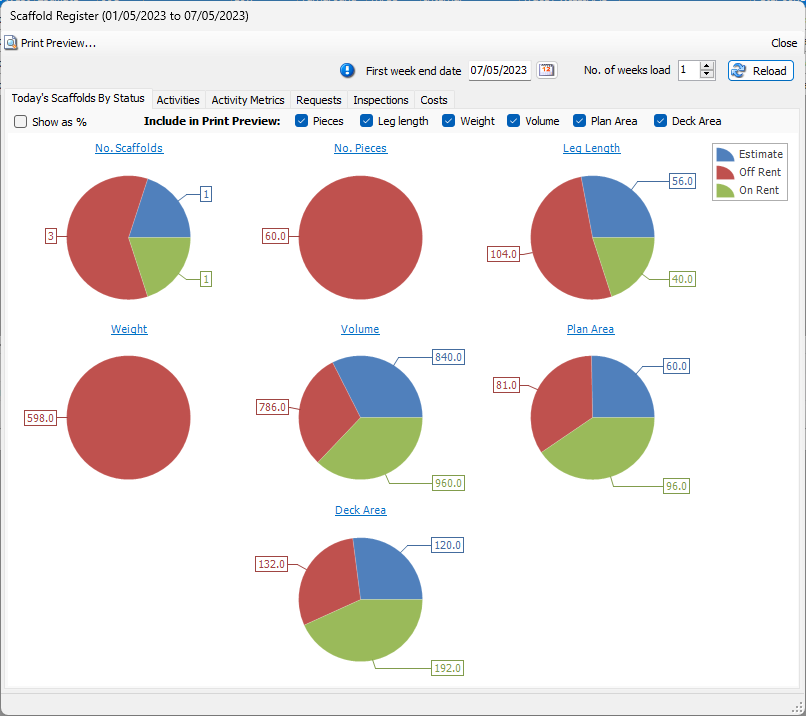
The Quantify Scaffold Register Dashboard enables you to view weekly Scaffold data in chart and graph format. Dashboard data includes:
NOTE: The features mentioned in this article are only available in the Industrial Edition of Quantify.
Today's Scaffolds By Status - Pie charts
Activities - Vertical bar charts
Activity Metrics - Vertical bar charts
Requests - Horizontal bar charts
Inspections - Line charts
Costs - Vertical bar charts

Viewing the Scaffold Register Dashboard for a Specific Week or Weeks
To view Dashboards for a specific week or weeks:
NOTE: The features mentioned in these articles are only available in the Industrial Edition of Quantify.
Click the appropriate location in the Organization Tree.
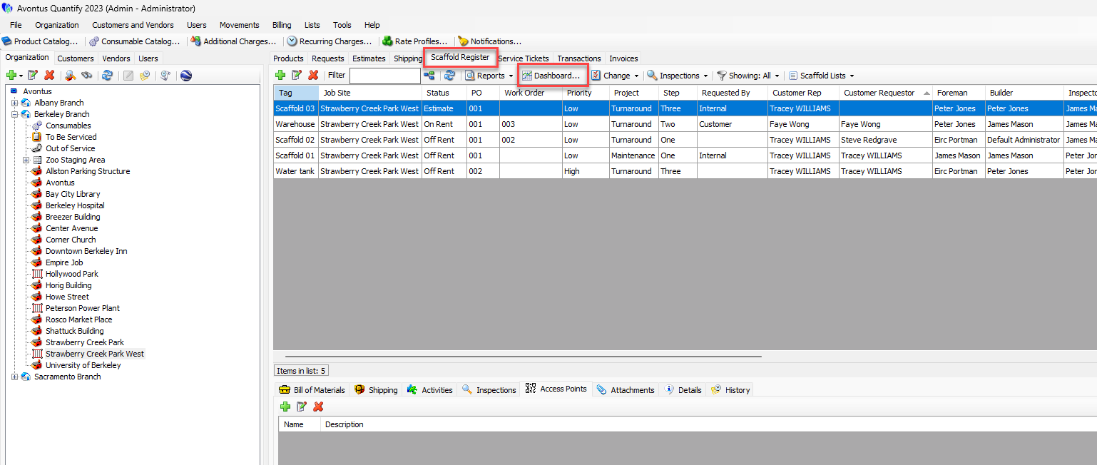
Click the Scaffold Register tab, then click Dashboard.
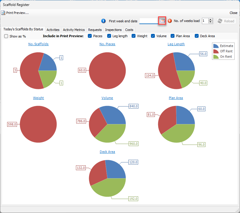
The Scaffold Register Dashboard appears.Click the First week end date calendar icon (
 ).
).
The calendar appears
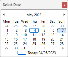
Locate and click the appropriate date.
You may enter any day in a week. Quantify will reformat the date to match the starting Sunday of that week. This will be the starting date used to filter the Dashboard.Click in the No.of weeks load text field and enter the number of weeks of data you want Quantify to load.
This determines the end date used to filter the Dashboard. Dashboard data is grouped by week: this will also determine the number of unique weeks displayed on the Dashboard.NOTE: Selecting more than three weeks for the Dashboard may result in difficult to read charts/data.
Click Reload.
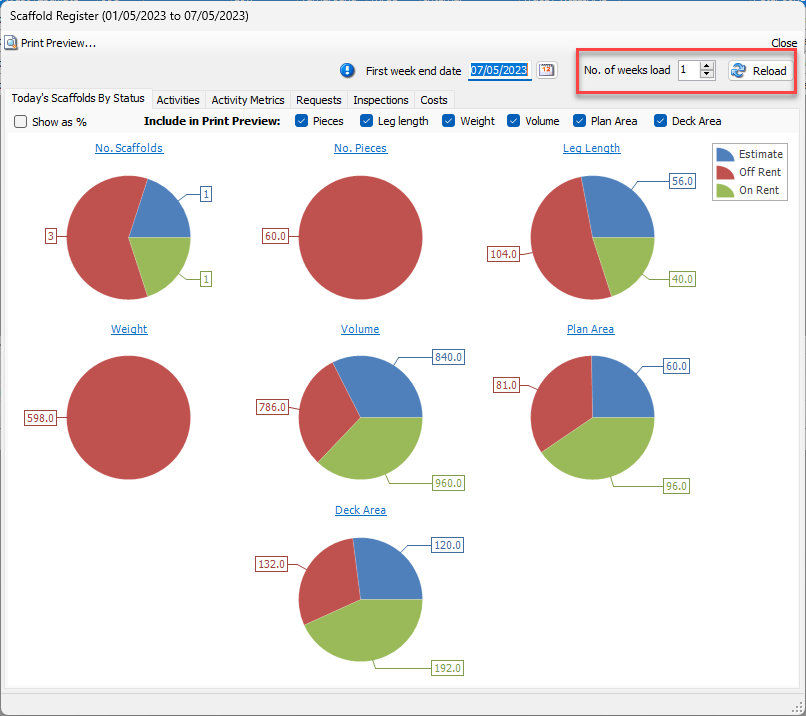
Quantify retrieves the selected information and displays it in the Dashboard.